
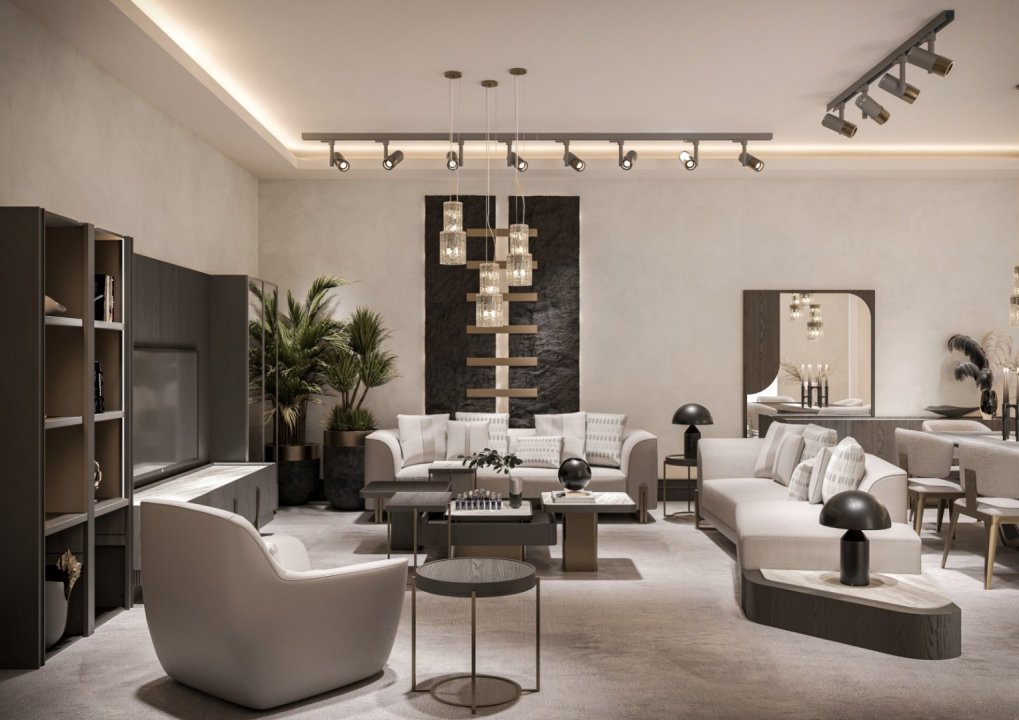
How to Achieve Harmony Between Fabric, Color, and Texture in Sofa Sets
Harmony between fabric, color, and texture in sofa sets is achieved by evaluating the upholstery together with the wooden details, natural light in the living room, wall color, rug, and curtains. When choosing a sofa set, it is important not to focus only on a preferred color, but also to consider how the fabric looks under different lighting conditions, how its texture works with the form of the furniture, and how it relates to the other materials in the room. The right combination helps highlight the sofa’s design details while creating a balanced overall look in the living space.
Why Should Fabric, Color, and Texture Be Evaluated Together?
The appearance of a sofa is not determined by color alone. The same color can appear deeper and richer on a velvet-like surface, while looking calmer on a matte or naturally textured fabric. For this reason, choosing a shade from a color chart alone is not enough to complete the decorating decision.
The surface structure of the fabric affects the way light is reflected. The visibility of the texture, together with the wooden frame and decorative details, contributes to the overall character of the furniture. Especially in models with prominent wood craftsmanship, the fabric should complement the furniture rather than compete with it.
How Should the Color of Sofa Fabric Be Chosen?
The first step is to examine the existing color palette of the living room. Walls, flooring, curtains, rugs, and large furniture pieces form the main color framework of the space.
Neutral tones such as cream, beige, taupe, and warm gray can be paired easily with different wood tones. More distinctive colors such as burgundy, navy blue, green, or brown can turn the sofa into the main focal point of the room.
The goal is not to make every surface the same color. Using secondary tones that complement the main shade creates more visual depth. For example, a cream sofa can be balanced with dark walnut wood and a warm beige rug.
How Does Fabric Texture Change the Design of the Sofa?
Texture is as powerful a design element as color. Smooth fabrics can make the form of the sofa appear clearer, while heavily textured surfaces can add visual depth to the furniture.
On a sofa with extensive carved wood details and ornamentation, a very busy fabric may create visual clutter. In such models, using a more controlled texture can allow the wood craftsmanship to remain visible.
With a simpler sofa form, textured fabric can be used to add character. In this way, decorative impact is created not only through color or pattern but also through the surface of the material itself.
How Should Wood Color and Fabric Be Matched?
If a sofa set includes visible wooden sections, the fabric should not be selected independently from them.
Dark walnut and espresso-toned woods can create a strong contrast with cream, stone, light beige, and warm neutral shades. With warmer brown or honey-toned woods, beige, taupe, and earthy colors can create softer transitions.
If the furniture includes gilded or decorative metallic details, the fabric color should not compete with them. When the wood surface is already highly detailed, a calmer upholstery color can help emphasize the craftsmanship.
Can Different Fabrics or Colors Be Used Within the Same Sofa Set?
Yes. The three-seater, two-seater, and armchairs do not all have to use exactly the same fabric or color.
Neutral tones can be used on the main sofas while a complementary color is introduced on the armchairs. For example, dark green, burgundy, or brown armchairs can add depth next to light beige sofas.
However, when different colors are used, the fabrics should share at least one common characteristic. This connection can come from texture, color temperature, or wood tone. Surfaces with no visual relationship may make the set look fragmented.
What Should Be Considered When Using Patterned Fabric?
Patterned fabric can add character to a sofa set when used carefully. However, if the furniture already has a strong form and detailed wood craftsmanship, the amount of pattern should be controlled.
Large patterns are generally easier to appreciate on wider surfaces. Small and densely repeated patterns can make the form of the sofa appear visually busier. Therefore, the scale of the pattern should be selected according to the size of the furniture.
The pattern does not need to be used across the entire set. It can be introduced on an armchair, decorative cushions, or selected upholstery sections to create a more restrained accent.
How Does Natural Light Affect Fabric Color Selection?
Fabric colors may look different in a showroom, under artificial lighting, and in the natural light of the home. For this reason, evaluating a fabric sample in the actual lighting conditions of the living room can be very useful.
In rooms with strong daylight, some colors may appear lighter. In darker rooms, deep fabrics may make the furniture look heavier than it actually is.
The direction of the windows and the angle of incoming light are also important. Rather than relying only on catalog images or a phone screen, examining a physical fabric sample usually leads to a more accurate decision.
Should the Rug and Curtains Be the Same Color as the Sofa Fabric?
The rug, curtains, and sofa do not need to be exactly the same color. In fact, small variations in tone can add more depth to the room.
For example, with a cream sofa set, the curtains can be a lighter off-white while the rug includes beige and warm gray transitions. This keeps the room within the same color family without making it look monotonous.
If the sofa fabric is patterned, keeping the curtains and rug calmer can create balance. If the sofa is plain, subtle pattern or texture can be introduced through the other textiles.
How Can Texture Balance Be Created with Decorative Cushions?
Decorative cushions are one of the easiest and most controlled ways to add color and texture without changing the main furniture.
If the sofa fabric is plain, cushions with texture or subtle patterns can be used. If the sofa already features a noticeable pattern, simpler cushions are usually a better choice.
The goal is not to use as many different fabrics as possible, but to add small, intentional layers to the main sofa upholstery.
Does Frequency of Use Affect Fabric and Color Selection?
The same fabric choices may not be equally suitable for a living room used every day and a guest room used less frequently.
In heavily used areas, ease of maintenance, abrasion resistance, and how visible everyday marks or stains are should be considered. Very light or very dark surfaces may show certain signs of daily use more easily than mid-tones.
For this reason, aesthetic decisions should always be made together with everyday usage habits. A fabric that looks attractive but does not suit the practical needs of the household may become difficult to maintain over time.
How Should the Fabric Selection Process Proceed?
The first step is to identify the main colors already present in the living room. Then, several fabric options can be selected according to the sofa’s wood tone and overall form.
Samples should be evaluated together with the walls, flooring, and curtains. After checking how the fabrics look at different times of day, texture and practical use characteristics can be considered.
Finally, the relationship between the main sofa, armchairs, decorative cushions, and other textile surfaces should be reviewed. This creates a consistent material palette for the entire living room rather than focusing on a single piece of furniture.
Real-Life Example: How Can Harmony Be Created with a Wood-Detailed Sofa Set?
Imagine a sofa set with carved wooden details in a dark walnut tone and light beige main upholstery. The light fabric highlights the dark wood while preventing the overall furniture piece from appearing too heavy.
A darker taupe or earthy tone can be used on one of the armchairs. Beige and brown transitions can be introduced through the rug, while off-white can be selected for the curtains.
Decorative cushions can include brown tones related to the wood or controlled patterns. In this way, the sofa, rug, curtains, and accessories are visually connected without all being exactly the same color.
Common Mistakes in Fabric, Color, and Texture Coordination
One of the most common mistakes is selecting fabric based only on a small swatch. A strong color that looks appealing on a small sample may appear much more dominant when applied across a large sofa.
A second mistake is choosing all furniture and textiles in exactly the same color. This can make the room feel flat and lacking in depth.
Another common mistake is using strong patterns, carvings, gilded details, and heavy textures all at the same time. When one design element is already dominant, keeping the others more restrained helps maintain visual balance.
 ARA
ARA
 CANLI DESTEK
 HARİTA